Digital Literacy Digital Literacy: Visual Communication and Computer Images Paul Martin Lester, Ph.D. Associate Professor Department of Communications, H-230 CSUF Fullerton, California 92634 657.449.5302 FAX: 657.773.2209 at lester@fullerton.edu
Textual Material: (c)1995-1996 ALL RIGHTS RESERVED
a pictures's worth 1,000 words?
Edwin Land, inventor of the Polaroid photographic camera and 60-second process (so useful for love-struck and immodest honeymooners as well as those wanting to demonstrate digital photography with a flatbed scanner, but without a still digital camera) made an important remark about his creative and technical invention process that is of value to all of us who have allowed pixelated patterns of light to fill our eyes and minds with color and wonder:
If you can conceptualize it, you can build it.
Forty years or so after his call for technological creativity, a paraphrase is needed:
If you can digitize it, you can build it.
Computer-generated images (CGI) in motion pictures is an obvious and relevant example of the magic of digitization. Edward Zajac of Bell Laboratories in 1963 began the field with his simulated trip around the globe based on satellite still photographs. Hollywood caught on several years later. The first major motion picture that included any computer graphics at all was the 1976 science fiction thriller Futureworld. The only computer example in the movie was a computer- mapped head of actor Peter Fonda on a monitor. The next year, George Lucas directed Star Wars, which contained a limited amount of computer graphics on video display terminals. Computerized plans for the Death Star were displayed on a large screen during a briefing about battle strategies. Interestingly, the elaborate extraterrestial spaceship "dogfights" were not computer-generated images as many assumed but were created with complicated staging and masking technigues with small-scale models by a company that was formed for this specific purpose, Industrial Light and Magic (ILM).
The first movie to feature computer graphics as a specific plot line was the Disney box office disappointment Tron (1982). Although the motion picture seems to be completely computer-generated, only about twenty minutes of the film, much of it during the Light Cycle race, was produced on a computer. Newsweek, Time, and Rolling Stone hailed computer graphics as an important advance in motion picture production. However, the technology benefits of such publicity were delayed because the public wasn't interested in a story about a video game programmer who could go inside his machine. Many experts have predicted that if Tron had been a success, the field of computer-generated images for movies would be even more advanced than today. Nevertheless, major motion picture producers started to use computer graphics effects in numerous movies. For example, in the 1980s there were such releases as Star Trek II: The Wrath of Khan (1982), 2010 (1984), The Last Starfighter (1984), Young Sherlock Holmes (1985), Flight of the Navigator (1986), Labyrinth (1986), and Willow (1988).
Animation on television and in the movies is also an important use of computer technology in story-telling. The 1990s saw the Walt Disney Company involved with pen-and-ink and computer rendered animation projects that turned into instant classics: Beauty and the Beast (1991)-the first animated motion picture to be nominated for Best Picture by the Academy Awards, Aladdin (1992), and Pocahontas (1995). Another breakthrough is the 1995 release of Toy Story, the first motion picture in which every frame was generated by CGI technology.
Tom Brigham introduced us all to a computer software effect he invented while working at the Massachusetts Institute of Technology. The process is called morphing and it was first seen during the SIGGRAPH exposition of 1982. The technique revolutionized the way images were constructed and presented and he won a special technical achievement Academy Award in 1993. His idea has its roots in Emile Cohl's 1908 animation classic Phantasmagoria and the live-action sequence in The Wolf Man (1941). Morphing quickly became a popular effect as it allowed dynamic and powerful transitions between images that audiences enjoyed. Not only was it used in movies (In the Line of Fire, 1993), but also for television commercials (Schick Tracer) and music videos (Michael Jackson's "Black or White").
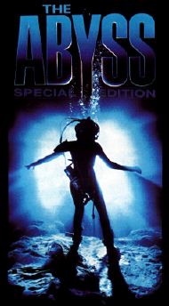
A breakthrough in the use of computer-generated images, whether morphed or not, were two science fiction movies by the same director, James Cameron. He and his staff created two of the most memorable characters in recent motion picture history. One was a gentle, compassionate, funny, and positive living force; the other was a violent, insenitive, and cold-blooded killer. The smiling, rippling water snake, termed "water weenie" by the crew featured in the motion picture The Abyss
(1989), and the murderous T-1000 liquid-alloy robot in Terminator 2: Judgment Daywww.soton.ac.uk/~pdc194/cameron/abyss.html
(1991) introduced theater audiences to images totally fabricated through the use of the computer.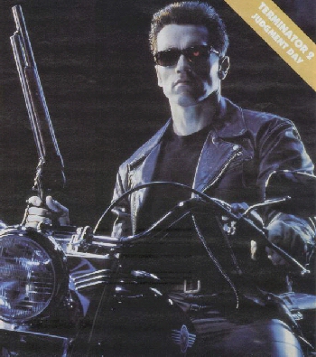
www.soton.ac.uk/~pdc194/cameron/t2.html
From the crude and quickly rendered image of Peter Fonda's head in Futureworld to the fantasy visions come-to-life in The Abyss, Terminator 2, Jurassic Park, and Apollo 13, computer technology, as never before, demonstrates that there can be a solid link between the mind and the monitor. As James Cameron said when he announced the formation of Digital Domain, a company started with Scott Ross and Stan Winston with IBM, they will help filmmakers "realize the pictures in their heads." But a story can never rely simply on costly effects that are meaningless, poorly rendered, or confusing. Tron and The Last Starfighter failed at the box office, not because the computer graphics were poorly accomplished, but because the stories weren't compelling. As with other media, visual messages must always stress the message before the visual.
In the movies with the lights dim, the screen huge, the sound loud, and the popcorn buttered, digital imagery, when combined with gifted and tenacious producers, allow us to either believe that what we're seeing on the screen is real, or better yet, to not even assume that what we're watching is unreal (a controversial notion with still and moving images used in documentary and journalism contexts). For example, how many audience members questioned the brief, overhead, digital composite liftoff scene in Apollo 13?
And just as computers are a valuable and integral part of movie-making, digital convergence-the creative, technical, and sociological merging of previously diverse and separate tasks, machines, and personnel with the aid of a computer-has made an enormous impact on all manner of media.
www.d2.com/bj/what.html
Typographers use software to turn words into pictures. Graphic design programs are so useful that amateur family members can exchange holiday form letters as either magazines, newsletters, newspapers, or on-line home pages. Worksheet applications are sophisticated enough that those yearly missives can include informational graphics such as tables and charts to tell the story of the family in a more complete way. Cartoonists can participate in the recent explosion of animated images on television and in the movies. Photographs can be made, sent, altered, used, and stored almost as easily as words. And whether it comes at the end of this millennium or at the start of the next, it is inevitable that a machine-the teleputer- will become a common feature in homes across the world as it combines the telephone, television, and computer to (hopefully) turn passive viewers into active users of this new, on-line, interactive medium.
But will this digital dream of pixelated positiveness simply result in easier ways to churn out an endless supply of contentless, mind-numbing, confusing, and forgettable pictures? If your answer is no, chances are you've discovered a secret about visual messages-they can be read with as much meaning and insight as text.
Being visually literate allows you to slow down the fast-paced stream of images so that you can study a picture for a longer amount of time. Think of the process of mentally damming the unedning picture current by remembering the last time you walked on a country path, drove on a rural road, or rode an airplane over a large, grassy field. Each type of trip produces a drastically different mental response. And although you will certainly get from A-to-B faster in a plane, you will no doubt see and remember many of the visual messages you notice on your leisurely walking tour more than from looking out a window at 37,000 feet.
Quick-cut and overlapping editing techniques, for example, are the jet engine form of pictures. Many educators, social critics, and parents (among others) voice concern for a generation that seems to have become addicted to these fleeting photons. But if we were all taught visual literacy from our earliest grades with the same skill, funding, and vigor as the subjects of reading, writing, and mathematics, we would learn to stop, linger, and notice the tiny details that form a visual message so that they have a chance to become meaningful, unique, explainable, and memorable.
It is difficult in 3,500 words (or in three-and-a-half photographs) to detail the complex field of visual communication. But here is a brief introduction to the components that comprise the concept of visual literacy.
It takes a knowledge of the history, properties, and sociological characteristics of light. Light is the natural starting point for a picture's analysis because images receive life through this form of electromagnetic energy. Having an understanding of the nature of light-how it shapes the objects we see and how it can direct our attention-is vital for image analysis and creation.
It takes a knowledge of how light affects the eye,
the retina, and the brain. The physiology of these vital body parts is a model for many of the machines that help make the world more visible. An understanding of the basic components of the eye and brain can lead to insights regarding the images that cameras and computers produce.
www.bvis.uic.edu/bvl/eye/
It takes an understanding of the four visual cues that the brain is physically designed to notice-color, form, depth, and movement. Every image, whether still, moving, real, or imagined, can be broken down into simple graphic components. Because of the way the brain functions, these graphic elements combine to make quick sense of what the eyes see. Each visual cue has its own set of symbolic components that have been agreed upon over time within specific cultural groups. Being able to identify and use those basic graphic elements helps in the analysis and production of the elements of a picture.
Color is described through three methods: objective (scientific measurements of temperature and size of a wavelength), comparative (comparing a color to a known, agreed upon description such as sky blue or blood red), and subjective (the mental state of a viewer determines a color's emotional responses).
And as with all visual messages, we have associated meaning to the colors we see that is often separate from the thing colored. For example, in ancient Egypt, red was associated with the highest social class which was why women painted their fingernails that color. Purple, for many, means dignity or sadness. Green connotes versatility, ingenuity, and envy. And of course, blue is for boy and pink for girl babies.
Form is divided into three parts: dots (the smallest point that can be made with a stylus), lines (a series of dots placed so close together that they merge into straight, diagonal, and combination lines), and shapes (lines formed into patterns that include the parallelogram (square and rectangle), the circle, the triangle, and combinations). A dot (whether as an actual mark or a small shape) that is alone and within a frame will immediate command attention. Lines pointed upward give a positive feeling. Diagonal lines are viewed as more dynamic than horizontal or vertical lines. A square person is boring and so is the shape. A circle can mean the world. An equilateral triangle, as in the Egyptian pyramids is stable but a bit dull, while an isosceles triangle, as the form of the Washington monument, is dynamic and powerful.
Depth is a complicated concept that includes eight factors that increase or decrease the perceived depth of an image: space of the visual array, size relative to the frame, color, lighting, texture gradients, interposition, time, and perspective (the most complex of the depth factors as it includes illustionary, geometrical, and conceptual perspectives).
Finally, movement is either real (actual, unmediated movement), apparent (as with a motion picture-a still image that appears to move), graphic (the way a viewer's eyes are directed to look through a picture), and implied (the illusion that a graphic design moves on its own as in optical art examples).
It takes a knowledge of how the gestalt theory contributes to our understanding of how we notice and group the things we see. Guided by the phrase, "the whole is different than the sum of its parts," the gestalt approach to visual communication includes the laws of: similarity (things are grouped if their characteristics are alike), proximity (things are grouped if they are situated close together), continuance (our eyes try to fill in incomplete parts of pictures that are covered by an overlapping graphic element), and common fate (things are grouped together if they seem to be headed in the same direction). A graphic designer will often play against a gestalt law so that a viewer will notice a particular element (a company's logo or an important character in motion picture).
It takes an understanding of semiotics-the study of signs-to discover how every image is a complex collection of symbols with distinctive meaning depending on the culture of the viewer. According to the semiotic approach, images can be classified by into three signs: iconic (picture elements that resemble the thing they are meant to represent), indexical (elements that lead to a logical assumption by the viewer), and symbolic (elements that derive their meaning from learned cultural cues). For example, an alarm clock image on a watch is iconic, the moving second hand representing the passing of time is indexical, and the type of watch a person wears (whether analog or digital) is symbolic.
Semiotics also recognizes that any image is actually a complex collection of individual signs that are grouped together to form meaning. This collection of elements is called codes. If you make assumptions about the subjects of a visual message from the elements in a picture, you are using the mytonymic code. If you are making mental comparisons between various elements, you are employing the analogic code. If an element is used as a replacement for another (beer bottles and cigarettes as phallic symbols), it is an example of a displaced code. And if elements combine to form unintentional and deeply complex visual messages as with MTV- type music videos, you are seeing a condensed code.
It takes an understanding of the cognitive approach to visual communication that acknowledges several processes within the mind including: memory (rememberence of past images and their associations), projection (finding meaning in the forms of inanimate objects or astrological signs), expectation (having a preconceived idea of what to expect within a given visual array), selectivity (focusing on a particular graphic element within a picture because of a memory association), habituation (becoming accustomed to the images you see everyday), salience (noticing images that are more important or have a special meaning for you before other images), dissonance (two or more competing activities that cause you to lose your concentration), culture (the way people act, talk, dress, eat, drink, behave socially, and practice their religious beliefs), and words (the textual material included with an image).
It takes knowing how images are used to educate, entertain, but mostly, to persuade. When controlled by economic interests and corporate considerations, pictures can be powerful tools to persuade people to buy a particular product or think a specific way. In the fourth century B.C., Aristotle was the first to write about the art of persuasion. He defined it as communication designed to influence listeners' choices. According to Aristotle, persuasion has three components: ethos (a source's credibility), logos (the logical arguments used to persuade an individual), and pathos (the emotional appeals used in the persuasive argument). Persuasive messages that are viewed as reliable, seem to make sense, and include emotional images, are the most likely to persuade. Persuasion-in various degrees-is a powerful motivation in almost all messages created for advertising, public relations, and journalism purposes.
It takes a knowledge of how images can forever stereotype an individual as part of a cultural group-whether in fact or fiction. Cultural groups that are stereotyped are not limited to ethnic groups such as African Americans, Latinos, or Native Americans, but can also include gender, age, physical characteristics, sexual preference, and job-related groups of people. It is because images are often such powerful and emotional messages-they make us think as well as feel-that they contribute to images that injure. A creator of images has an ethical and moral responsibility to ensure that a picture is a fair, accurate, and complete representation of someone from another culture. Too often, however, that knowledge is gained after an image causes harm. Fortunately, sensitivity and knowledge about other cultures can give you an understanding of the correct use of pictures.
It takes an understanding of six ethical philosophies that can be used to analyze the motives of image-makers and the effects on image-watchers. The six philosophies are: categorical imperative (a rule that is always followed), utilitarianism (the greater good for the greater number), hedonism (a personal, live-for-today approach), golden mean (a compromise between two extreme points of view), golden rule (treat others as you would expect to be treated), and the veil of ignorance (considering all people as equal or the "the shoe on the other foot" approach).
It takes an understanding of each medium of presentation (typography, graphic design, informational graphics, cartoons, photography, motion pictures, television, computers, and networked interactive multimedia) so that you can look at an image in terms of six perspectives: personal (an initial gut reaction), historical (the picture's place in history), technical (how it happens that you can see an image), ethical (identifying the possible motives and effects of images according to the six philosophies above), cultural (identifying the symbols used in images for the society as a whole), and critical (to transcend a particular image and draw general conclusions about the medium, the culture from which it is produced, and the viewer).
And finally, it takes time. Time to appreciate the morphing face of a water pseudopod, the "sticky taffy" effect of an evil alien, the realism of running dinosaurs, and the exhilaration of a woodpecker's view of a rocket's liftoff.
Using a knowledge of visual literacy will greatly help in analyzing individual pictures, scenes, programs, or genres. An analysis of the use of CGI in the motion picture industry is also possible. Not too long ago, computer graphics could be identified easily. Colored lights on video displays, fantastic trasformations between animals and people, or unrealistic fantasy creatures within equally strange make- believe environments were easily recognizable as being computer-generated. Even the digitized dinosaurs in Jurassic Park, as wondrous as they are, cannot be mistaken for clay models, mechanized puppets, or existing animals with a lot of makeup and theatrical body appliances. The audience necessarily suspends reality during a motion picture in order to be entertained. Context therefore may be more important than content for establishing the degree of believability of the visual message.
The next generation of computer graphic effects will break down the notion (which was never true anyway) that seeing is believing. The folks at Industrial Light and Magic
are already accomplishing this next logical step: computer-generated humans. From computer renderings of deceased politicians and actors to completely fabricated human beings, creating realistic pixalated people is possible. Already, digital humans are being used in complex and dangerous motion picture stunts as seen in Judge Dredd (1995). Hollywood studios are about five to ten years from introducing a movie featuring virtual actors, or vactors, exclusively. Dennis Muren admits that "I don't know where the end of this stuff is. I mean, how real is real?"
www.lucasarts.com/pages/Product.219.html
Determining whether any image-for print or screen media-is an icon that represents a live-action actor or is a completely computer-generated fabrication simply will be impossible. Within the context of entertainment, such a technical innovation is awaited with great anticipation by viewers who want to be thrilled, writers and directors who want to turn their immaginations into screen reality, and producers who want to save money by not having to hire so many actors. Agents, actors, stunt personnel, prop people, makeup artists, and even caterers (as vactors don't require chef salads and bottles of spring water) are among those who will not be thrilled by advances in computer technology.
But in other contexts-journalism, documentation, education, anthropology, government record keeping, and even personal photography-undetected computer manipulations of visual messages is a more serious concern. If the fine line between what is real and not real dissolves into a sea of pixels, the carefully nurtured concept of historical believablity becomes another commodity in competition with entertainment. A culture that accepts computer-generated manipulation for journalism or in other documentary contexts is one that loses its link with the past and the future. When it becomes acceptable in a society for a computer graphics operator to manipulate the content of a news photograph, that society is doomed to live in an everlasting present moment where serious social problems can never be solved because its people will be unable to learn from history and anticipate change.
One possible solution may be to try to walk through the visual messages that fly by so that you can really see each one. In that way you can make your own paraphrase of Land's statement:
If you can see it, you can know it.
Because the more you know about visual communication, the more you will see.

www.pomona.claremont.edu/visual-lit/intro/intro.html
Thanks to Karen Sullivan of SYGGRAPH and
Brian Stonehill of the On-Line Visual Literacy Project of Pomona College

Link to the Visual Communication Home Page